
CSS Flexbox Layout
A Complete Guide to Flexbox
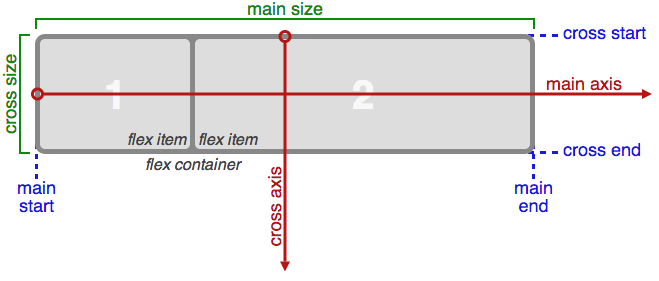
Basics & Terminology
Flex consist of parent container and its children flex items
Properties for the Parent (flex container)
display
.container {
  display: flex; /* or inline-flex */
}
flex-direction
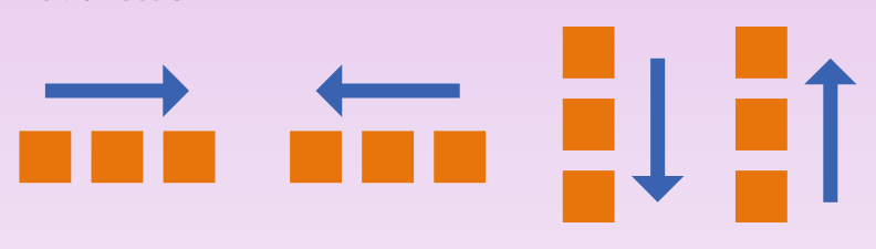
.container {
  flex-direction: row | row-reverse | column | column-reverse;
}
flex-wrap
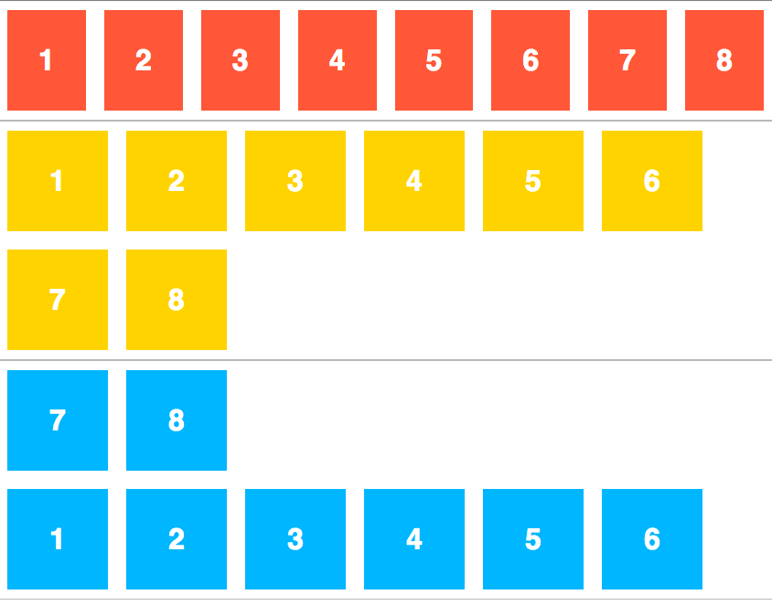
.container {
  flex-wrap: nowrap | wrap | wrap-reverse;
}
flex-flow
This is a shorthand for flex-direction and flex-wrap. Default is row nowrap
.container {
  flex-flow: <'flex-direction'> || <'flex-wrap'>;
}
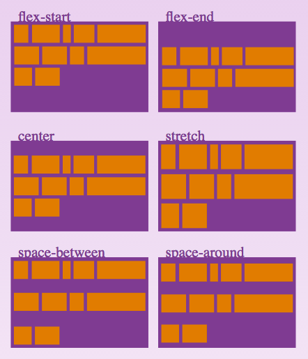
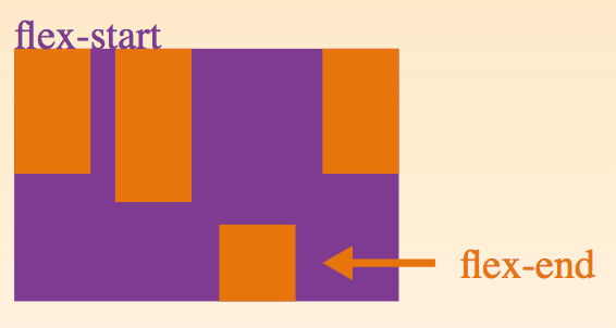
justify-content
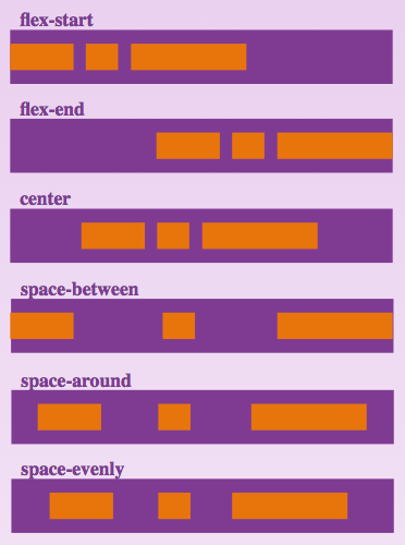
.container {
  justify-content: flex-start | flex-end | center | space-between | space-around | space-evenly;
}
align-items
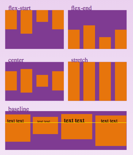
.container {
  align-items: flex-start | flex-end | center | baseline | stretch;
}
align-content
.container {
  align-content: flex-start | flex-end | center | space-between | space-around | stretch;
}
Properties for the Chidren (flex item)
order
.item {
  order: <integer>;
}
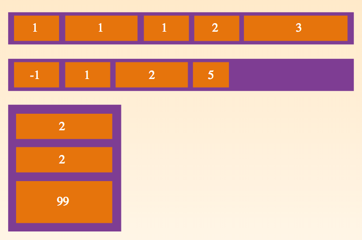
flex-grow
.item {
  flex-grow: <number>; /* default 0 */
}
flex-shrink
.item {
  flex-shrink: <number>; /* default 1, negative numbers are invalid */
}
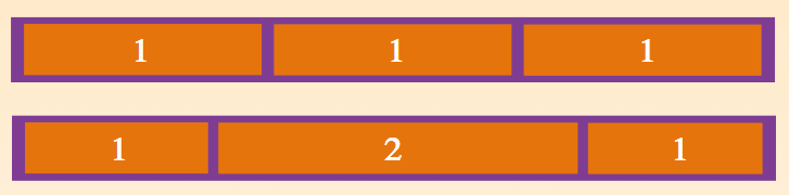
flex-basis
.item {
  flex-basis: <length> | auto;
}
flex
This is the shorthand for flex-grow, flex-shrink and flex-basis combined.
The second and third parameters are optional. (flex-shrink and flex-basis)
Default is 0 1 auto
.item {
  flex: none | [ <'flex-grow'> <'flex-shrink'>? || <'flex-basis'> ]
}
flex-grow
.item {
  align-self: auto | flex-start | flex-end | center | baseline | stretch;
}
Prefixing Flexbox
@mixin flexbox() {
  display: -webkit-box;
  display: -moz-box;
  display: -ms-flexbox;
  display: -webkit-flex;
  display: flex;
}

@mixin flex($values) {
  -webkit-box-flex: $values;
  -moz-box-flex:  $values;
  -webkit-flex:  $values;
  -ms-flex:  $values;
  flex:  $values;
}

@mixin order($val) {
  -webkit-box-ordinal-group: $val;
  -moz-box-ordinal-group: $val;
  -ms-flex-order: $val;
  -webkit-order: $val;
  order: $val;
}

.wrapper {
  @include flexbox();
}

.item {
  @include flex(1 200px);
  @include order(2);
}
Written on July 28, 2017